

Renzo Piano Embraces Chicago
By NICOLAI OUROUSSOF
CHICAGO — America has been suffering from Renzo Piano fatigue.
For years Mr. Piano seemed to be snapping up all the best commissions: the renovation of the Morgan Library & Museum in Manhattan, a science center in San Francisco and museum additions in Los Angeles, Boston, Chicago and Fort Worth. (He even designed The New York Times Building.)
Many of his peers gripe that this is because of the subdued nature of his designs — sophisticated but not too threatening or unfamiliar — which seem tailored to ease the insecurities of museum boards. Some envy his elegance, which makes him seem equally at home in corporate boardrooms and lofty cultural circles.
It’s hard to know how these qualities will play out amid the gloom and doom of the new economy. In some ways Mr. Piano’s refined, risk-averse architecture may be more appealing than ever. He is not out to start a revolution. His designs are about tranquillity, not conflict. The serenity of his best buildings can almost make you believe that we live in a civilized world.
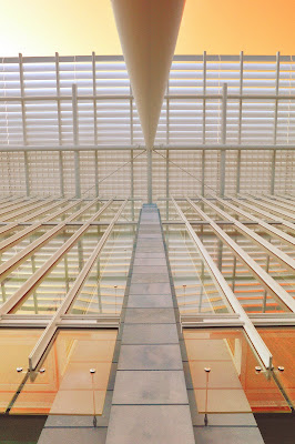
The new $294 million Modern Wing of the Art Institute of Chicago, which opens on Saturday, is the closest Mr. Piano has come in at least a decade to achieving this near-classical ideal. Its delicate structural frame is a sparkling counterpart to the museum’s 1893 Beaux Arts building. The light-filled galleries show the Art Institute’s marvelous collections of postwar and contemporary art in their full glory, including many works that have been buried in storage for decades. Most of all, the addition manages to weave the various strands of Chicago’s rich architectural history into a cohesive vision, one that is made more beautiful by its remarkable fragility.
The 264,000-square-foot wing is the largest expansion in the museum’s 130-year history. The addition stands behind the original building, across a set of commuter railroad tracks. The two structures are joined by a small gallery building from 1916 that bridges the tracks. Millennium Park, its far end punctuated by the swirling steel forms of Frank Gehry’s band shell, extends to the north.
Seen from the park Mr. Piano’s structure immediately brings to mind the work of Mies van der Rohe, a pillar of modern architecture who moved to Chicago from Germany in the 1930s. The taut forms and refined details, the elevation of an industrial aesthetic to an art form — all are hallmarks of Mies’s work. Mr. Piano’s towering glass-and-steel facade, with its floating roof and excruciatingly slender columns, even evokes a lighter, more ethereal incarnation of Mies’s 1968 Neue Nationalgalerie in Berlin, a landmark of 20th-century design.
Mr. Piano carefully knits these forms into the surrounding fabric. The addition’s main entry hall is parallel to the tracks, so that their grittiness becomes part of the overall composition. A series of heavy walls that frame the entry are made of limestone to match the original building. A long, slender bridge, one of the design’s most whimsical features, connects the addition to the park across the street.
The play between Modern and classical themes continues inside. The entry hall, a long towering space enclosed beneath a glittering glass roof, could be a contemporary version of a cathedral, designed for the worship of art. Its elongated form is used to draw you into the building. From there people turn and look out at a grassy outdoor court before climbing a staircase to the main galleries. The staircase, suspended on slender rods, was inspired by Mies’s design for the Arts Club of Chicago.
Some will feel that the journey from the front door to the art is too drawn out, but it gives you the impression of having ascended to “a sacred space.” Occasionally Mr. Piano’s galleries can be too precious: the level of refinement gives them a cool, almost sterile feel. But these rank among his best. The rooms are beautifully proportioned. A thin steel border frames the plaster walls, giving them a clean industrial look.
Mr. Piano also seems to have created the right amount of intimacy between art and viewer, without completely shutting out the world. Floor-to-ceiling windows overlook the park and courtyard from some galleries. The windows are covered with white screens, lending the views a soft, ghostlike quality. This effect is reinforced by the layering of glass, which shuts out street noise and gives the sight of people walking below a particularly eerie, cinematic quality.
Read more

No comments:
Post a Comment